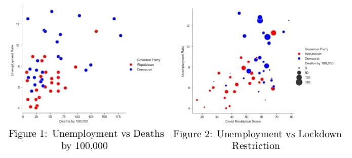
As the American presidential draws near, it is time to discuss one of the key talking points in this campaigning season: COVID-19 lockdown policies. Taking data from the CDC, the Bureau of Labor Statistics (BLS), and WalletHub’s COVID Restriction Score, the Policy Research Lab has created the following plots to analyze the Lockdown and COVID restrictions by state and along political party lines.

In Figure 1, each point on this graph indicates the unemployment rate by state and the respective governor party. In this graph we can see that higher unemployment rates can be associated to a high death rates. Yet, most of the state tend to have lower unemployment rates and have a death rate between 0 and 75 per 100,000. Then if we control for the COVID restriction score, we have Figure 2. This graph describes the policy approach each state has taken in terms of lockdown. Higher Restriction Scores indicate more aggressive lockdowns in the state. The graph tends to indicate that more aggressive lockdowns have led to a higher unemployment level. While, states with Democratic leaders have chosen more aggressive lockdowns on average, Republican led states have chosen less restrictive lockdowns as indicated by the graph.
For those who are interested in tracking unemployment claims and other economic metrics related to COVID-19, visit the Salem Center’s COVID site.


